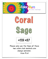
Good afternoon. A new month begins, so it's also time for a new colour combo from Color Hues.
Here's my take.
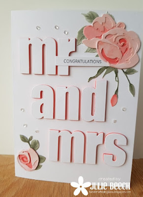
I made this card for my son's partner's father's wedding way back on New Year's Eve, it's a design I've used before here, but Alex thought it was perfect for her Dad and Karey's nuptials. I used Altenew's Rose Flurries dies and their large alphabet ones to create the design.
I find cutting the elements from white card allows me to get the range of colours needed, without hunting through my stash of card, often with disappointing results. I never seem to have the right colours!! This time I used a selection of Copic markers including R24, 22, 02 and YR02 for the coral coloured flowers and BG90, 93, 96 and 99 for the sage green foliage. The letters are mounted on white fun foam, which I edged with Altenew's Coral Berry ink first, on a 5 x7 white card base. The stamped congratulations is from a Sugar Pea set and the tiny sequins are from Pretty Pink Posh.
So where will these new colours take you? We'd love to see your designs in the Color Hues gallery this time. There's lots of fabulous inspiration from the DT and GDs over on the Color Hues blog if you need more ideas.
A few months ago I was contacted by Lori at the Turner Syndrome Foundation to see if I was interested in her card auction to raise funds for this worthy cause. I joined in last year so decided I would join in again, this time I was a little more organised! The auction is taking place on her Instagram account @mulchlady6, so why not pop along and join in and help raise some sorely needed funds. There are some fabulous card makers taking part including Sandy Allnock and Jennifer McGuire.


What a gorgeous card for a wedding card, I love the flowers and the shadow letters! Perfect and super modern!
ReplyDeleteI love that large sentiment and your shadows add such an impact to it! The roses are gorgeous. It all adds up to a wonderful card!
ReplyDeleteAbsolutely BEAUTIFUL Jules!! CAS perfection, and I love the shadowing behind the letters too! And I hear you about finding the right colors...I use an awful lot of white and blend different inks to come up with the right colors! Lovely, lovely card!! Hugs. :0)
ReplyDeleteWhen I saw this over on the DT blog I was in love immediately! This is outstanding, Julie!
ReplyDeleteThe bold graphic feel with the large alpha letter is a great juxtaposition to the elegant roses, Julie! What a fabulous design and way to use the colors!
ReplyDeleteStef
I am in love with the dimension. The shadows are just perfect. This is a stunner Julie!
ReplyDelete