Morning all, hope I find you well.
Its Tuesday so that means a new challenge over at Cardz4Guyz.
This week we would like to see your take on the theme of -
METAL
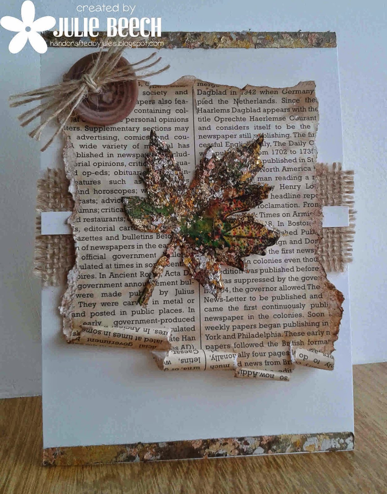
Now I've gone a little off piste with this card as I was wracking my brains and craft room for inspiration, then at the back of one of my drawers I came across some metal leaf I bought years ago to do some canvases for the old lounge and together with inspiration from a couple of other challenges I was away!
I used the sketch over at Sketch Saturday for the layout and the recipe at Less is More -Newspaper to create this, and as everything I used came from scratching around my craftroom it also fits with the theme at Simply Create Too.
The leaf is one I made a while ago and then used a different one so it was in my bits to use later box. I inked it with Versamark then added SU heat n stick before adding the metal leaf. The newsprint is also from SU that has been sitting around for at least a couple of years. The top and bottom of the base card were edged in the leaf on top of some d/s tape, before burlap( from the stash) and newsprint panel distressed with Vintage Photo, were added. The button and twine were also from the stash. Even the card base is some card I've had for a few years!
Simply Create Too - Shop in your Craft Room
OK, its over to you now. Pop over to the main blog to check out the rest of the DT's inspiration and join us.
Thanks for calling by, see you again soon. :)


OMG Jules, this is STUNNING!
ReplyDeleteGreat combo of challenges and perfect for ours!
Thanks so much
Chrissie
"Less is More"
Your card is fantastic, love the collaged elements !!
ReplyDeleteWow, just proves why we crafters don't throw anything away. Fantastic use of your collective finds. Thanks again for your inspirational DT project for Cardz 4 Guyz. Caz
ReplyDeleteStunning card, brilliant. I love the curl of the paper and the hessian, great textures.
ReplyDeleteElaine
What an amazing stash you must have!! Love the leaf, and the newspaper looks brilliant too. Perfect for a gent!! xx
ReplyDeleteFabulous newsprint card Jules.
ReplyDeleteLoving those tattered and distressed edges.
Thanks for sharing
Sarah
Less is more
What a brilliant masculine card, love all the interesting texture!
ReplyDeleteThank you so much for joining us this week at Less is More
Anne
LIM Designer
Love this Jules - very shabby grunge x
ReplyDeleteFab card love all the texture and dimension:)
ReplyDeleteVal x
This is so very cool and creative !! Love it the way u used newsprint :)
ReplyDeleteThis is an absolutely FAB card, so much interest and texture while still CAS. Forget the guyz - while it's great for a man, I'd be absolutely thrilled to receive a work of art as wonderful as this!
ReplyDeleteJane
Amazing design Julie!! Love the metal leaf ... and love the distress and rolled edges of the newsprint backing --- awesome! Loll xx
ReplyDeleteWonderful card! The metal leaf looks awesome with the newsprint paper. Love it!
ReplyDeleteWow, fab card, absolutely love all the texture, gorgeous. Thanks for joining us at Sketch Saturday this week, Niki xx
ReplyDeleteThis is super! I love your added texture and the contrasts between the burlap and the guilding and the newsprint and all that white space too. It's a perfect entry for our challenge at Sketch Saturday this week and I'm delighted you played along with us. Hugs, Lesley
ReplyDelete